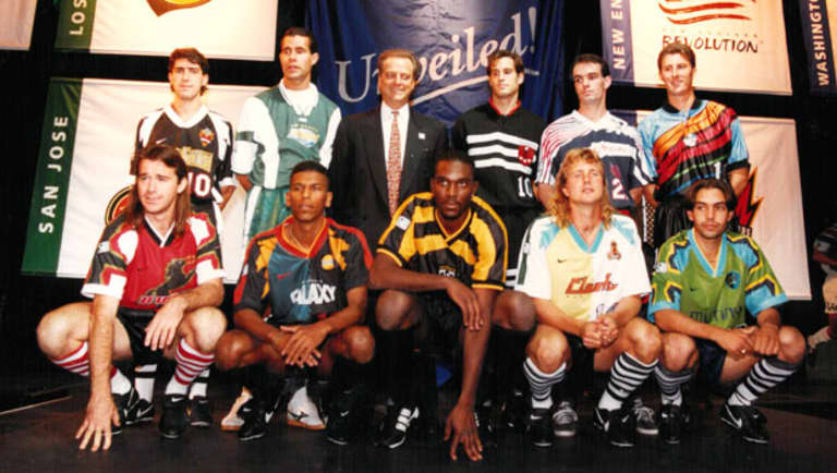
Odds are you’ve seen the photo – THAT photo – from the unveiling of the 10 inaugural MLS kits ahead of the league’s 1996 debut.

That black-and-gold
Columbus Crew
uni has been slept on a bit, and it could be argued that some of those other outfits are so striking they’re now coming back into style, a quarter-century later. But the clear winner is the one being sported by John Harkes (back row, third from right): The all-black
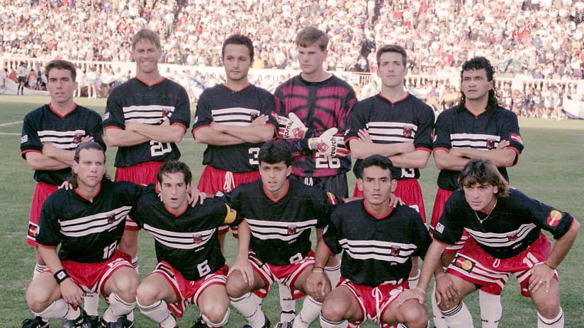
D.C. United
kit with the European-inspired eagle crest.
So how did D.C. settle on such a timeless look and identity? As it turns out, it took a little bit of Real Madrid, a dash of Michael Jordan, conversations with four different apparel companies, one fateful trip to Oregon and, above all, the persistence and insistence of United’s founding president Kevin Payne.
“Skateboard culture is what drove a lot of the other designs,” recalled Payne, currently CEO of US Club Soccer, in a conversation with MLSsoccer.com. “It was this notion that the sport was going to succeed because it was somehow counterculture, and the kids understood it and their parents didn't. But the company that I was affiliated with, Soccer USA Partners, we had been putting on games all over the country for the national team for four years, and we knew that there were a lot of people that cared about the sport, and that identified with teams from overseas.”
The Washington MLS team was originally among the clubs assigned to Nike for branding and uniforms, and the league had given the Swoosh merchants wide leeway in designing those looks. According to Payne, Nike planned to hand the organization its entire identity as a turnkey package, with no local input.
“‘I'm telling you right now that's not the way it's going to work,’” Payne remembered telling the sportswear giants. “‘We have a very specific idea about what we want our team to represent and we think we're right.’ And so we kind of amicably agreed not to work together.
“Nike also told us that our name was going to be Revolution. That's where that name came from. We said what do you mean, what does that have to do with anything? And they said, ‘well, we don't mean like American Revolution, we mean like the Beatles song.’ And I said, ‘You guys are thinking way too hard about this.’ So they actually allowed the league to give that name to the New England Revolution, where it made more sense.”
Chats with Reebok and Umbro also proved fruitless, and by now it was the late summer of 1995; the clock was ticking. So Payne called on a friend at adidas, Ken Chartier, to set up a visit to the company’s North American headquarters outside Portland. That led to a meeting with Peter Moore, a designer who’d hatched Nike’s iconic Michael Jordan “Jumpman” concept before breaking ranks to join the Three Stripes, where he’d help lead a renaissance of the illustrious German-headquartered brand.
Payne’s request: A simple, traditional soccer identity with solid colors – “and I did not want red, white and blue, because that was too obvious” – akin to Real Madrid’s world-famous all-white kits. Moore proposed an all-black look. Payne was smitten. And they quickly sketched out a white-red-white alternate strip and the rough draft of what would become United’s stern eagle crest.
“And that was it,” said Payne. “I mean, literally, this all happened in one day at the adidas offices in Portland.”
Noted Chartier: “In my recollections, Peter was pretty quick, after listening to Kevin and what his vision was, churning something out that I think was one of the best designs, maybe, in the history of the league.
“Peter Moore is a special individual,” he added. “As with any world-class artist, sometimes you make mistakes and you come up with things that are just way off the charts, and they fail. But other times you hit a home run … and Peter’s hit a million home runs.”
As for the bold, distinctively adidas three stripes across the chest and thighs?
“We didn't have a problem with that,” said Payne. “We thought it made the uniform look better.”
Payne’s dogged pursuit of his vision for D.C. United eventually paid off, making the capital club one of the most recognizable teams in MLS and setting the tone for a club that’s made only minor adjustments to their look in the 25 years since.
“It was a very frustrating time,” he reflected of the leadup to that first season, “and we thought that we were right. And I think time has shown that we probably were right.”


