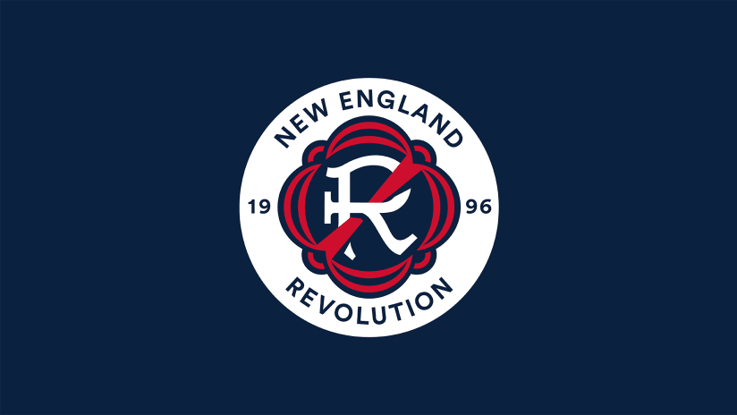
The New England Revolution became the latest MLS team to unveil a new crest today. Please note: That does not say New England FC or New England Old Boys or New New England SC. As they’ll proudly tell you today, the Revolution have elected to not become “another FC.” The New England Revolution name is here to stay.
However, the league’s oldest logo, affectionately known as the “Crayon Flag,” is officially living out its last days. On Dec. 15, the flag will be replaced by the fresh New England Revolution logo. A new crest and a new direction that the Revolution feel mirrors their progressing on-field identity and relevance in the New England sports landscape.
While emotions will oscillate around seeing the crayon flag officially become a throwback, even its most steadfast supporters will admit that it’s from a different era. Remember, the original branding of MLS teams – and this is not a bit in any way – was inspired by skateboarding. The folks in charge at the time saw soccer as a counterculture sport, just like, ya know, skateboarding. Plus – still not doing a bit – Japan’s J League had just launched some jerseys based on anime and that had gone over pretty well. Why wouldn’t skateboarding work too? (???)
The Revolution got lucky in that it would appear only the original jerseys went totally through the '90s car wash. There’s a reason the crayon flag has outlasted every other original logo. There were no scorpions or mutant cyber bats or fire-breathing electrohorses to be found.
That’s due in large part to the original fans of the team. In particular, Joseph Bracken, a 17-year-old high school student at the time from Quincy, Massachusetts. Bracken won a “Name the Team” competition, suggesting that the name fit the region’s history well. Mercifully, the logo attached to the name ended up as an abstract American flag and not a fireball shooting mutant windmill.
"It was just so visceral"
Now the club’s current fans are keeping that name alive. Not only by singing chants with lyrics like “26 years and still the same, Revolution that’s our name” at matches, but by making their voices heard loud and clear when presented with an opportunity for change. When MLS and New England held conversations with casual fans and diehards alike about the next era of the team, the fiercest and most consistent opinion centered around holding onto their identity as the Revolution.
“It was just so visceral when they spoke about the name and what the name meant,” Revolution vice president of marketing and community engagement Cathal Conlon told MLSsoccer.com. “It would have been easy for us to go to the agency and say, ‘Yeah, look, we're from a very historic region, we're going to be New England FC and give us it back.’
“But our fans will speak much more openly than I would and say that this other MLS team’s name doesn’t mean anything. It’s just a European name added on because they heard it somewhere else. They said, 'Don’t do that. Don’t become Inter Boston because it doesn’t mean anything.'”
Those discussions that led to retaining the old Revolution name are the same ones that led to the new crest. While it became clear quickly that the fans felt an attachment to the name, the crayon flag didn’t invoke similar feelings among the majority. To fans, the name itself insisted on history and unique identity. But the logo, from the days of tie-dyed jerseys and no ties, represented a lack of progress.
So the Revolution got to work, looking for a design that connected the region with its heritage as a kindling spot for rebellion against the crown. On the surface, that doesn’t seem so hard. There’s an abundance of well-established iconography in the region’s connections to the American Revolution and even in already often used symbols by Revolution fans, like the flag of New England.
The problem then is that there are a few too many symbols and images that are recognizable but maybe not instantly identifiable. And if you tried to combine them all instead of parsing out the pieces that most fit your club’s identity, we’d be sitting here today talking about the Revolution’s exciting new crest featuring Paul Revere firing a pine tree out of a cannon.

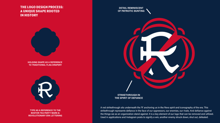
The club focused on the act of revolution instead. The most concrete element of the crest comes from one of American history’s most defining moments of rebellion, the Boston Tea Party. The R in the center of the crest comes from lettering found on the crates of tea thrown into Boston Harbor. The outlining shape is a bit more abstract, but is based on the red, white and blue bunting often seen in Revolutionary War imagery and still used in events throughout the city today. And then there’s the strikethrough laced through the R, an element the team frames as anchoring the Revolution in positive defiance.
"The team is evolving"
Of course, even if you weren’t aware of the intended meaning behind those elements, you may have already seen the crest long before today. Admittedly, it hasn’t been the best-kept secret. But it does officially come at perhaps the best possible time.
The Revolution have just set the regular-season points record and won their first-ever Supporters’ Shield. The Audi 2021 MLS Cup Playoffs are approaching and New England have a Round One bye and likely MVP Carles Gil. In a moment the Revolution are hoping marks a leap forward in their personal identity, the team itself has already taken the biggest possible leap forward – sparked by the Bruce Arena era beginning in May 2019. Those leaps paired together may just help to lead somewhere new. In multiple ways.
“We couldn't have asked for a softer landing spot, to be honest. There's a lot of positive sentiment around the club. If we were trying to do this in a five-win season, I think whatever we put out would have been greeted with absolute contempt because we were spending time on anything other than fixing the on-field products. I think our, our logo, our identity was lagging the rest of the club. It was trailing the progress you've made everywhere else,” Conlon said.
“We were evolving and the team is evolving. The league is evolving and sports are evolving and our visual identity had to evolve with that. I think it's the next step in the progression to where we're going as a club. Right. And ultimately we all want it to end up in a shiny new stadium in downtown Boston at the end of the day. That's the ultimate end game. And this is the next piece along the way that it had to evolve.”
A proudly defiant piece, as well.


