One of MLS’s newest clubs looked both abroad and within, and to their past and future alike, to find their identity.
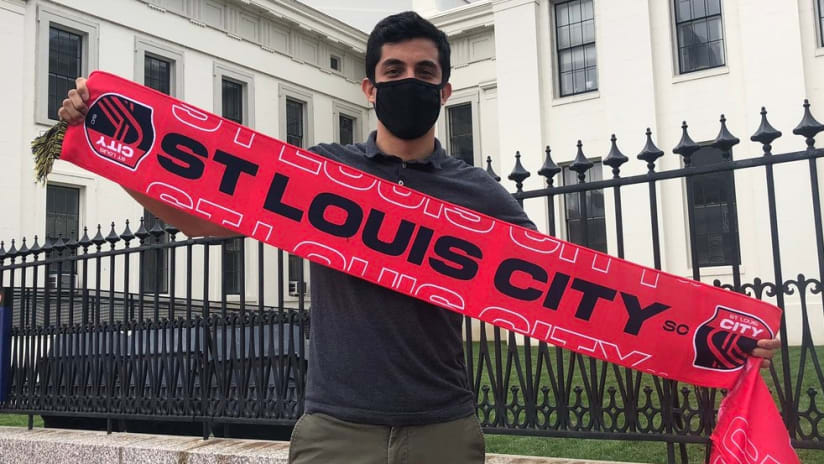
The group formerly known as “MLS4TheLou” is now St. Louis City SC, as the 2023 MLS expansion arrivals unveiled their name and crest on Thursday, merging a classic Old World soccer moniker with their ambitions for rallying their wider region via a new conception of place and citizenship.
“It was a great opportunity to first of all embrace our proud heritage, but also a way to really highlight our diverse cultures, our iconic neighborhoods and really find a way to expand how the word ‘city’ is used in the St. Louis region,” majority owner Carolyn Kindle Betz told MLSsoccer.com on Thursday morning. “We then started to gain a lot of momentum and a lot of steam and realized that we could definitely make sure we get this whole region to rally around St. Louis City SC.”
“City” carries extra meaning in greater STL, where extensive suburbanization in the post-World War II era led to St. Louis proper, an independent city, having a population of only about 300,000 residents compared to some 2.8 million across the wider metropolitan area, which spans two states and 15 counties. Kindle Betz & Co. aim to “bring everybody together” with their club’s name and downtown stadium.
“When we say we want to expand it, that means whether you're from the north, south, east or west, you're all going to come and unite under the umbrella of St. Louis City SC,” she said. “So the hope would be that … when you think of the city it does include the entire region, because we do have the support of the entire region.”
The club solicited extensive public input as they went about their decision, and while tongue-in-cheek suggestions like “Louventus” and “Lazer Snakes” drew much of the attention, the process pointed them towards their eventual choice.
“We thought it was very important that the fans had a say in the name. And so what we started to see was there was a couple key words that kept reappearing and were actually quite popular, and City was one of them,” said Kindle Betz.
“I really, truthfully, didn't think anybody was going to be that excited about Lazer Snakes or Trash Pandas,” she deadpanned. “But I will say, to see the excitement about a name in general was really, really cool and exciting. I think while we had some funny names, City is a name that’s known internationally in the soccer/football world, and I believe that St. Louis is an international city; we need to have an international club, which means we have to have an international name.”
As co-owner and Chief Brand Architect Lee Broughton explained, the city’s famous Gateway Arch, its location near the confluence of the Mississippi and Missouri rivers and the bold colors of its flag – expect that same bright red to be the main color of the team’s kits, by the way – are the main visual elements of the crest.
“When we really spent time with fans, community members, getting their input, it became very clear that the iconic landmarks that are so famous about our geography were going to play a role,” he said, emphasizing that the design process was led by local talent.
“If you squint you'll even see a ball going through a goal, kind of pointing towards that sense of optimism and ambition that we have as an ownership group, as a club and as a region, that inspires aspirations for growth and cultural renaissance,” he added.
In Thursday’s announcement, Broughton also alluded to the “SC” part of the name as a “double entendre” of SC, denoting not only a soccer club but also a soccer capital, a nod to STL’s history as an early cradle of the beautiful game on this continent.
“We think there's an opportunity for [the club] to be a symbol of the future of reinvigoration, re-inspiration,” he explained to MLSsoccer.com. “The word [City] is actually derived from citizens, right? So it's really about the people of the region, with all our beautiful colors and creeds uniting together in the crucible one day, which will be the stadium that we're going to be building.”


