Would you like to see an awesome, newly released club crest and kit design for recently announced 20th Major League Soccer team, New York City FC?
We've solicited some ideas from readers in the past regarding what the club's "look" and design identity should be, and that was a lively discussion. We also highlighted an ongoing design contest and some of the great work being done there, a little while back.
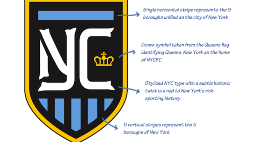
And then came along one of the best concept designs as a whole — colors, crest, three kits, goalkeepers kit and some scarves — to date. Twenty-nine-year-old California designer Mike Retrum came up with the following crest and primary kit designs. To see the rest of his entire concept, you'll have to visit his website. Particularly, you're going to want to see the third kit design, which is not shown here.
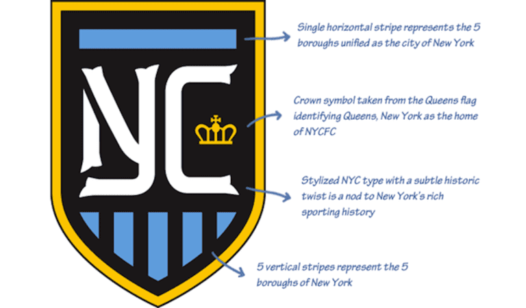
Classy, royal, the five boroughs.
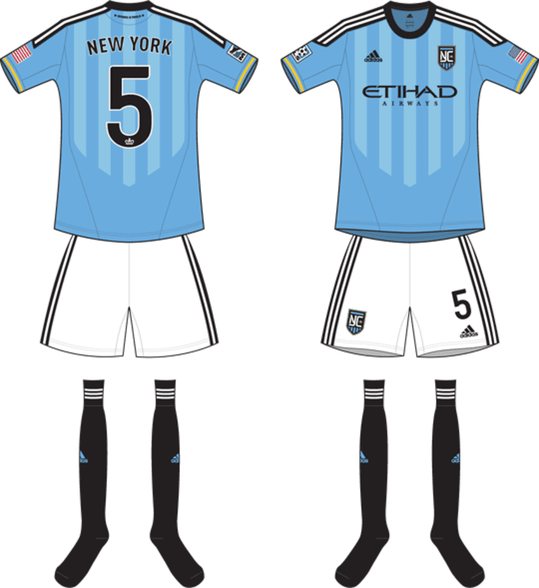
Sharp, clean, incorporates part of the club crest across the entire front of the jersey. It's very "Manchester City," which we all suspect the actual kits will be in 2015, but it doesn't look like a Manchester City kit.
To see the rest of Mike's entire design concept for NYCFC, visit his website.


